
If you are a manager, you may have once tried to write down what you do. How did you write it down? In the form of a list of activities? A Gantt schedule or a critical path drawing? Perhaps yet another way. However, to illustrate the activities of a manager and his team for the purpose of work automation, the method of drawing directed graphs is most suitable. I’ll introduce you to this method below, and you can read my article on the subject, in which I illustrate the manager’s work in the form of graphs.
A graph is a mathematical structure used to represent relationships between objects. Each graph has vertices (nodes) and edges (called arrows in directed graphs). Each edge begins and ends at some vertex (node). In undirected graphs, edges do not show, for example, which vertex is the cause and which is the effect of some phenomenon. However, when depicting the work of a manager, a directed graph should be used, because the edges depict the activities performed by the manager (or his team), and time flows in only one direction. Thus, in one vertex we have the beginning of the activity and in the other the end.
The layout of organizational quantities uses graph theory to represent primary (vertices) and derived (edges) organizational quantities.
Graph theory is very powerful and is useful for depicting many phenomena, especially the relationships between elements of these phenomena. I will show the use of graphs with a simple example of two activities – setting goals and describing tasks, and the drawing was created as a result of analyzing the activities of a manager in one of the experiments I conducted. I used my TransistorsHead.com tools http://transistorshead.com/ to record managerial activities.
In Figure 1, the green color indicates the manager’s initiated activities (goal setting and task description). Blue color indicates activities of viewing previous findings (goals or tasks). Red color means editing previously created goals and tasks, and orange color means deleting previously created goals and tasks. The acronym “Px” stands for a P process numbered from 1 to n. “Cy.i” stands for a C goal numbered from 1 to m in the i-th version. “Zz.j” is a Z task numbered from 1 to n in the j-th version.
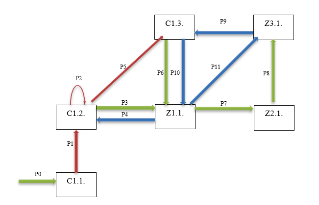
Figure 1: The activities of a manager represented as a graph
How to read such a graph?
The manager created target C1.1. (activity P0), then edited target C1.1. to version C1.2. (activity P1), edited target C1.2. again, but did not apply changes to it (activity P2). Then he created task Z1.1. (activity P3), and then looked at target C1.2. And so on….
You can find the full article here:
Ustalanie celów i zadań za pomocą narzędzi menedżerskich online – wyniki obserwacji